AI Art Styles 2026: Which Ones Are Actually Worth It
Summary
AI art styles in 2026 range from a handful of looks worth your time (anime, Renaissance portrait, the doll effect) to generic filters padding out bloated libraries. This breaks down which styles actually hold up, why preview thumbnails lie, where skin tone bias and HD paywalls still bite, and how to turn a style into something worth posting instead of scrolling past.
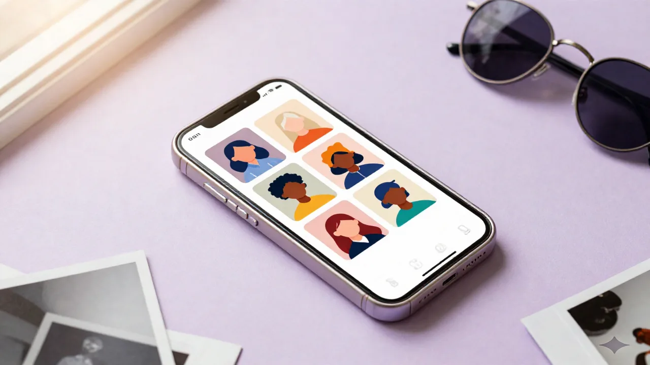
The ai art styles worth your time in 2026 are not the ones with the biggest filter count. They're the handful that actually hold up once the novelty wears off: a specific anime look, a candlelit Renaissance portrait, a Y2K doll effect that doesn't just smooth your face into plastic. Everything else is filler in a library of 500 filters you'll never open twice.
That's the whole review, honestly. Now here's why.
So What Even Counts As an AI Art Style Right Now
An "AI art style" used to just mean a filter. Slap a preset on your photo, done. Warmer tones, a vignette, maybe a grain overlay. That's not what's happening anymore, and the difference matters for what you should actually expect from these apps.
Now it's a full repaint. The model looks at your face, your lighting, your expression, and rebuilds the whole image in a different visual language, oil painting, cel-shaded anime, doll porcelain, chrome Y2K collage. Some keep your bone structure and just change the medium. Others regenerate you almost from scratch, using your photo more as a rough sketch than a source of truth.
That distinction matters more than the style name on the button. A "style transfer" model keeps your actual face and repaints the texture around it. A full generative model looks at your photo, extracts a rough likeness, and builds a new image that might share your hairline and not much else. Two apps can both call their output "anime" and mean two completely different processes underneath, which is exactly why the same style name gives you wildly different results depending on where you tap it.
The Styles Actually Blowing Up Right Now
Anime is still the anchor. Not generic anime, specifically the soft painterly Ghibli-adjacent look with warm gradients and hand-painted texture. It's forgiving on most face shapes because it smooths structure without erasing it. That's why it keeps resurfacing every few months under a new trend name even though the underlying style barely changes.
Renaissance portrait had its moment and it's not fully gone. Candlelit, oil-style, a little smug in the eyes. It works best on close-up selfies with visible shadow, the kind where your jawline actually catches light. Full body shots flatten out and look like a costume photo instead of a painting, which is the fastest way to spot someone who picked the style without checking their source photo first.
Then there's the doll effect, big eyes, porcelain skin, delicate features. It's polarizing in a way most styles aren't. Some people post it once and never again because it reads as "not me" too hard, almost uncanny. Others build a whole aesthetic around it and lean into exactly that uncanniness on purpose. There's no in-between reaction to this one, which honestly makes it good content either way.
Action figure style had a real run too, boxed toy packaging, plastic joints, accessory blister pack. It's fun exactly once. By the third version you've seen on your feed, it stops registering as content and starts registering as a template everyone used the same week, which flattens the novelty that made it work in the first place.
Y2K chrome and vaporwave collage sits a level under those four. It's less about the face transformation and more about the background, iridescent gradients, holographic textures, early-2000s internet clutter layered around the subject. It pairs well with a doll or anime face style rather than standing alone as its own thing.
If your app's filter list feels thin next to what you're seeing on your feed, that's usually a model access problem, not a taste problem. Some platforms have dozens of underlying image models behind one filter button, letting you pick a specific look instead of whatever single house style your default app happens to ship with. Worth knowing before you assume a look "just isn't possible" on the device you already have.
The Ones Everyone Recommends That Kind of Suck
Generic watercolor and sketch filters. Every list has them, including some you'll find higher up on this exact search result page. Almost nobody's version looks intentional. It reads as a Photoshop plugin from ten years ago dropped onto a modern photo, and the mismatch between "AI generated in 2026" and "looks like a 2013 preset" is obvious at a glance.
"500 filters in one app" as a selling point. More filters means more scrolling, not more good results. A library that big is a discovery problem dressed up as a feature, and most people give up browsing before they find the two or three that would've actually suited them.
Pixel art selfies. Cute for a profile picture once. As a repeatable content style it falls apart fast because pixel art strips out exactly the facial detail that made the photo worth transforming in the first place. You end up posting something that could be anyone.
Generic "professional headshot" AI filters marketed at everyone. They're built for LinkedIn energy, not for a feed that lives on TikTok and Reels. Different job, different tool, and using the wrong one just looks stiff next to everything else on your grid.
How These Tools Actually Pick a Style For You
Most apps don't run one model. They route your photo through whichever underlying model best matches the style you picked, then apply a second pass for skin, lighting, and edge cleanup before handing you the final image. That's why the same "anime" tag can look completely different across two apps. You're not really comparing styles, you're comparing which model sits behind the button and how much post-processing gets layered on top.
This is also why preview thumbnails lie a little. The thumbnail in the app's style picker is often a cherry-picked best result pulled from thousands of generations. Your actual output is one roll of the dice, not the curated one you tapped on. Genuine imperfection is starting to outperform overly polished AI results on feeds right now, which is worth knowing before you chase the glossiest possible version of every style and end up with something that reads as fake precisely because it's too clean.
If you're building out a whole aesthetic instead of a one-off post, moodboarding the reference images first changes the output more than switching apps does. Vague prompt in, vague style out, no matter how good the model is on paper. That part isn't specific to any one tool, it's just how these systems work whether the app admits it or not.
Credits are the other thing nobody explains upfront. Most apps meter generations, not styles, so a "free" style can still burn through your daily allowance in three or four tries if the first couple come out wrong. Read the pricing page before you commit to a look that needs several attempts to land, because the app that felt generous on day one can start feeling stingy by day three once you're actually trying to nail a specific result instead of just browsing.
The Limits Nobody Puts In the App Store Screenshots
Skin tone representation is still uneven across most of these models. Lighter skin tones tend to get cleaner, more consistent results across styles. Darker skin tones more often get flattened detail or shifted undertones, especially on painterly styles like Renaissance portrait where the training data skews toward classical European portraiture in the first place. Most AI filters still read as filters rather than intentional style choices when the source photo has lower resolution or harsher lighting, and that gap shows up unevenly depending on who's in the photo and what device they shot it on.
HD exports are almost always paywalled. The free tier gives you a compressed, watermark-adjacent version that looks fine at thumbnail size on your camera roll and falls apart the second someone screenshots it or you try to print it.
And style consistency across multiple photos of the same person is still rough. Feed the same face into the same style twice and you can get two different jawlines, two different eye shapes, sometimes two different apparent ages. Fine for a one-off post, genuinely annoying if you're trying to build a consistent set for a whole grid or a slideshow.
None of this means skip the app. It means treat the first result as a draft, not a verdict. Regenerating two or three times before you judge a style is normal, not a sign the tool is broken, and it's usually the difference between a version you post and one you delete on sight.
Turning a Style Into Something Worth Posting
The styles that actually get engagement aren't posted alone. They're posted as a before/after, a transition, a "which one is real" bait, or a quick voiceover explaining why you picked that specific look over the ten others available. The static single image gets scrolled past in under a second. The context around it, the reveal, the reaction, is what makes someone stop.
Timing matters more than people admit. A style posted in its first two or three weeks reads as "look what I found." The same style posted two months later, once your whole feed has already seen ten versions of it, reads as late, no matter how good your specific take on it is. Ai art styles specifically have a short runway compared to most content trends. Track when a look started trending, not just what it looks like in the preview.
Should You Chase Every Trend or Pick a Lane
Both are valid, they just serve different accounts. Chasing every new style keeps your content feeling current but means nothing sticks around long enough to become recognizable as "your thing" to the people scrolling past it. Picking one or two styles and going deep, testing them across different lighting, different expressions, different crops, builds something people actually remember when they see your name pop up again.
Neither approach is wrong on its own. What's wrong is doing the trend-chasing version but only posting one photo per style and moving on to the next thing immediately, because that's the version that reads as generic no matter which style you picked or how good the model was that day.