Aesthetic Profile Picture Ideas That Beat a Filter
Summary
An aesthetic profile picture is a palette, a mood and one signature detail that agree with each other. Right now the looks that work are soft Y2K, raw flash and grain, dark academia and flat anime. Crop so your eyes sit a third from the top and your face fills 60 to 70 percent of the frame, then check it in a circle at thumbnail size. Pastel and AI-smooth looks will date fastest.

An aesthetic profile picture is a small square that tells people your vibe before they read a single word. Pick one look (soft Y2K, dark academia, raw flash, flat anime), crop it so your face survives a tiny circle, and keep the palette consistent with the rest of your page. Below: five looks that work right now, what each one needs, and where the whole thing falls apart.
What actually makes a profile picture "aesthetic"?
Not the filter. The filter is the last 10 percent.
An aesthetic is three things that agree with each other: a palette (pink and lilac, sepia, night blue), a mood (dreamy, brooding, caught-off-guard) and one signature detail (a butterfly clip, a stack of books, flash glare). When all three point the same way, your pfp reads as a person with taste. When they fight, it reads as a template.
Here's the test: shrink the image to thumbnail size and squint. If you can still name the vibe, it works. If you just see a beige blob with a face somewhere in it, redo it.
Soft Y2K: the one everybody is copying
Pastel pink, lilac gradients, glossy skin, a tiny chrome butterfly somewhere. You've probably scrolled past this one forty times this month, and that's the point: it's the safest "I have a vibe" look on TikTok and Instagram right now.
What it needs: bright, even light and a clean background. Window light plus a white wall does more than any overlay. Push the colour toward pink on the warm side and lilac on the cool side, and stop before the skin turns plastic.
The catch: because everyone is doing it, a soft Y2K pfp says "I follow trends" more than "I have a style." It ages in about one season. The pastel wave is a few years old and keeps getting renewed, which is why it's still here, but each round is shorter than the last.
Worth it if your page is fashion, music or fan content. Skip if you want to look original.
The flash-and-grain look (the anti-aesthetic aesthetic)
The loudest shift in 2026 is away from polish. Blur, grain, harsh direct flash, a face slightly off-center, a street behind you that's half out of focus. It looks like someone else took it at 1 a.m. and sent it to you without asking.
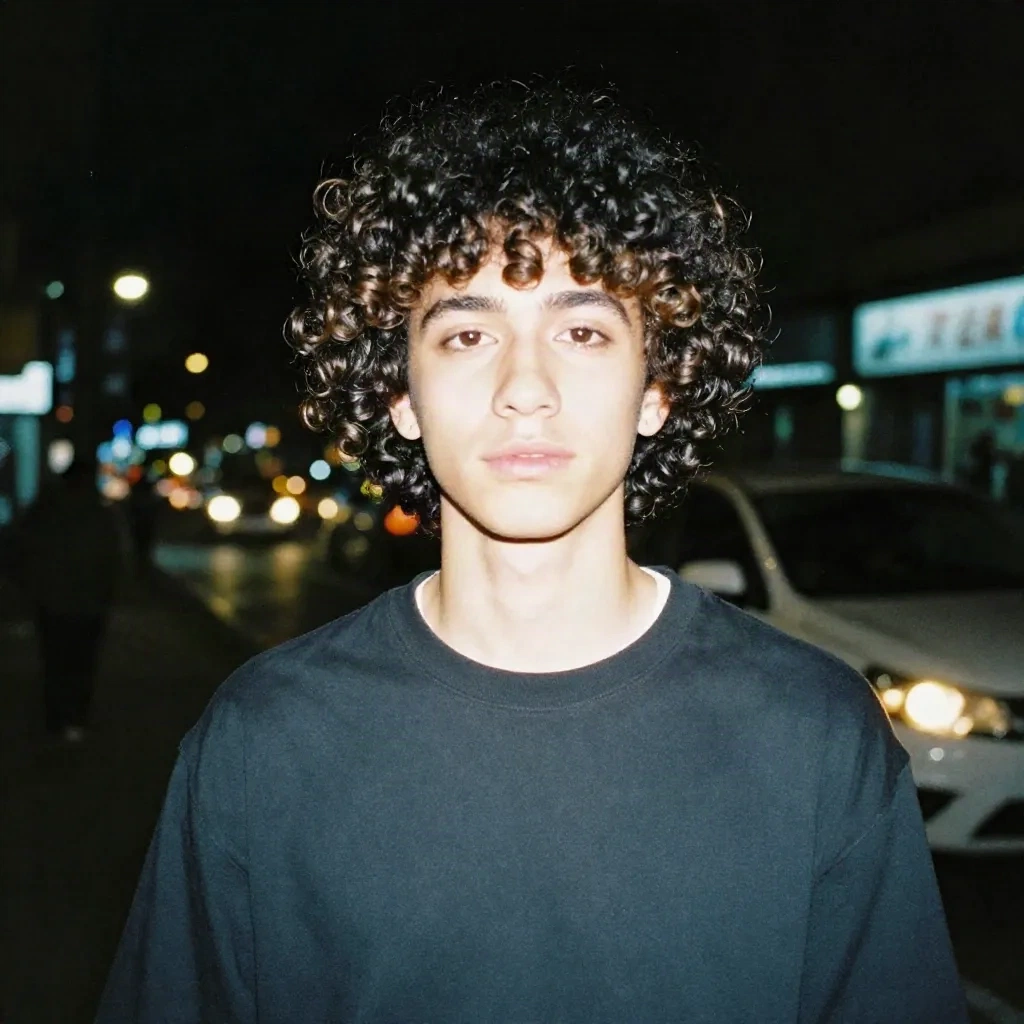
It works because it is the opposite of a filter. Everything else in your feed is smoothed and graded, so a raw frame reads as honest. A lot of the "authentic" look is carefully chosen though, so no, it's not automatically more real. It's just a different costume.
How to do it: use your phone's flash in a dark spot, take 30 frames, pick the worst-looking one that still has a good expression. Don't retouch. Add grain if the camera was too clean.
The limit: it needs a decent face crop. Flash flattens everything, and on small circles the harsh shadows can eat your features. Test the crop first.
Dark academia and noir: sepia, books, one good window
Moody browns, warm tungsten light, tweed or a dark collar, something literary half in frame. This one never fully leaves, because it isn't tied to a single trend cycle. It just comes back every autumn.
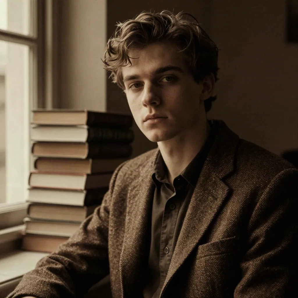
The trick is contrast. Pull the blacks down, keep the highlights warm, and let the shadows have texture. A window to one side gives you the shape for free. A desk lamp works too, as long as it's the only light.
The trap is the clichéd props. A stack of books is the dark academia equivalent of a stock photo. If you can swap the book pile for something specific to you (your actual shelf, a half-finished sketch), the pfp stops looking like a mood board.
Anime and flat illustration: for when you don't want your face up there
Bold outlines, flat colour, a pastel background, big eyes. This is the privacy-friendly option and also the one with the most range, from cute and rounded to sharp and edgy.
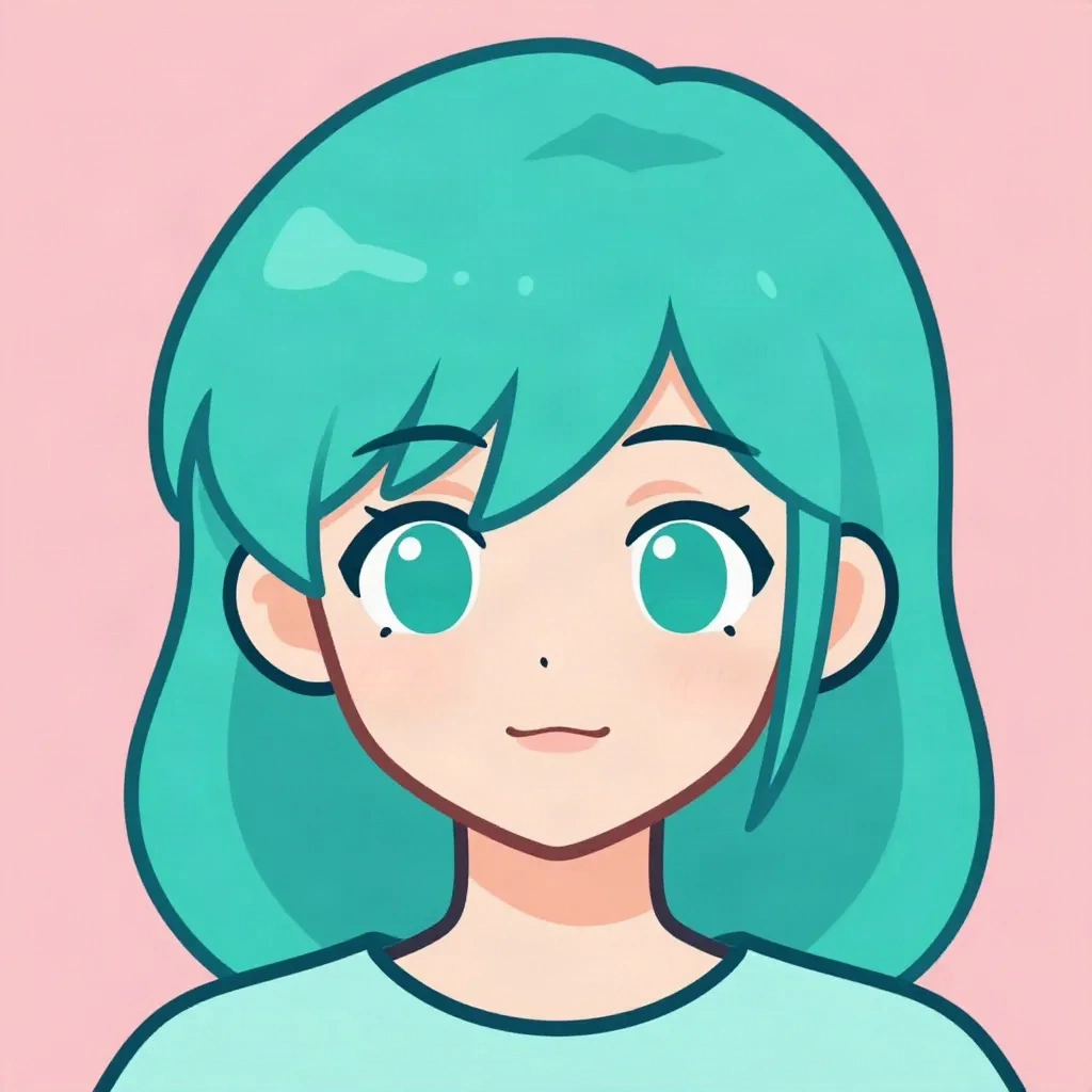
You have two routes. Draw or commission it, which gives you something that's actually unique. Or run a selfie through an AI style, which gets you something good in under a minute. Facetopia has 180+ styles, 10 free transforms a day, and a Pro plan at $6/mo. That's our tool, so weigh that accordingly. Lensa and Krea do their own versions, and Lensa's output is very clean.
The honest limits of AI avatars: the model can drift off your face, so the result looks like a cousin of yours rather than you. Glasses and very short hair also confuse some styles. Generate five and keep the one that still reads as you.
Pick this if you want a pfp that survives being tiny, since flat colour and heavy outlines hold up at 40 pixels. Skip if your page needs a real face (job hunting, creator brand, anything where people need to recognise you).
How do you make the crop work in a circle?
This is where most good pfps die. Instagram, TikTok, Discord and X all crop to a circle, and the corners of your photo vanish.
Three rules that hold up across every platform:
Put the eyes about one third from the top of the frame.
Let the face fill roughly 60 to 70 percent of the image. Anything smaller turns into a dot.
Upload square at 400 by 400 pixels or larger. Below that, the compression gets visible.
Preview it in a circle before posting. Literally cut a circle out of the screenshot. If your signature detail (the butterfly, the glasses, the flash glare) falls outside the circle, move it in.
Which aesthetic fits which platform?
Same picture, different app, different result. A quick map from what we see work:
Instagram: soft Y2K and dark academia. Close, expressive framing, because the circle sits next to your highlights and you want the palettes to match.
TikTok: flash-and-grain or flat illustration. The pfp shows up tiny in comments, so it needs a strong shape and one clear colour.
Discord: anime and stylised art. Nobody expects a real face here, and bold avatars read well in a crowded server list.
X: whatever you'd be fine seeing next to a bad take. High contrast helps, because the avatar is small and sits beside dense text.
Use one aesthetic across platforms if you can. Being recognisable on Discord and Instagram with the same face (or the same character) is worth more than being perfectly tuned for each.
What ruins an aesthetic profile picture?
The mistakes are boring and repeat all the time:
Too many effects at once. Grain, glow, a frame and a caption on one image. Pick the one that carries the vibe and delete the rest.
Over-smoothing. Heavy beauty filters flatten your face and push every pfp toward the same blank look. Keep some skin texture.
A busy background. At 40 pixels, a messy room is just noise behind your face.
Cropping at the chin. Leave room above your head, or the circle slices off your hair.
Using a photo that's too small. A 200 pixel screenshot upscaled to 400 looks soft on any modern phone.
Should one aesthetic run your whole page?
Short answer: yes, for the first three posts.
If your pfp is pink-lilac, your highlights, banner and last few posts should lean the same way. Visitors make a snap call on whether your page feels like a person with a point of view. A pastel pfp over a grid of grey screenshots gives mixed signals.
Then break the rule on purpose. One off-palette post per week keeps it from feeling like a brand kit. The aesthetic is there to be recognised, not to cage you.
Can you go faceless and still look intentional?
Yes, and a lot of people do. A faceless pfp is not a lazy option if you commit to it: an illustrated avatar, an object, a crop of a hand or a silhouette against a coloured wall. The rule is the same as any other aesthetic, which is palette, mood and one detail.
The thing to avoid is a random image from a search page. It tells people nothing and it's the fastest way to look like a bot. Even a flat colour with a simple shape you made yourself reads as a decision.
The downside is recognition. Without a face, you rely entirely on colour and shape to be memorable, so choose something with a strong silhouette and keep it for a while.
Which tools do what, honestly
Snapchat is the fastest free option for a face-based look, live camera and no upload wait, but the output is built for the feed, not for crisp downloads. Good for a quick test, not for a final pfp.
Canva is the one for palette control. You pick exact colours, add frames and grain, and keep them consistent across your highlights and banner. It won't change your face, which is exactly why some people prefer it.
Lensa gives clean polished edits and trend effects like Y2K digicam. It's strong on retouching, lighter on weird.
Krea is for people who want to push a look into stranger territory with prompts.
Facetopia is for the style swap: upload one selfie, see what 180+ styles do to it, pick the one that looks like you but better.
None of them replaces taste. They just save time.
What's going to date fastest?
Be honest with yourself about shelf life.
Soft Y2K and hyper-smooth AI portraits are the fastest to date, because they're the most copied. Dark academia and flat illustration last longer because they're less tied to a platform trend. Flash-and-grain is somewhere in the middle: it's an answer to over-polish, and the moment everyone does it, it becomes the new polish.
The practical move is to treat your pfp as a seasonal choice, not a forever decision. Swap it every few months. Keep one older version saved so you can bring it back if the new one flops.
What we'd actually pick
If you want one look and no overthinking: flash-and-grain for a real face, flat anime for no face. Both are less copied than pastel Y2K and both survive the circle crop.
If you're on the fence, test two versions in a story poll or send both to a friend. Ask which one they'd follow. Most of the time the one you're slightly embarrassed by is the right one.
The aesthetic profile picture that works is the one where you can still tell it's you, three scrolls later, at 40 pixels wide.